September 26, 2018
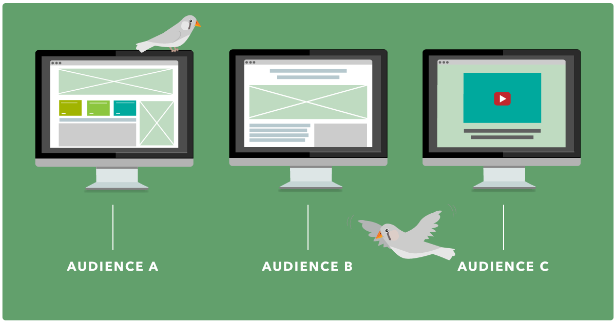
Are your web visitors all looking for the same thing?
As they say on Twitter, awhellllnaw!
Because your business, candidate, admissions office or juice bar has visitors with varying interests, you need to think seriously about landing pages. (Note the plural.)
Why? Because your home page is (and must be) a compromise:, an artful catchall of tactics to engage every kind of searcher, browser or wandering minstrel. You get 4.5 seconds to engage the mission-driven searcher (the most valuable kind of prospect).
An engaging landing page, on the other glove, says “I see just what I’m looking for. Yahtzee!” They see their hot need, center stage. Display a strong call to action (CTA) and you’re teed up to continue the dialog, future the lead – maybe even close the deal.
Think of your home page as a landscape to showcase your whole brand story. Display all your products or services. Narrate why you’re different/better/cheaper than your competitors, show what friendly reliable folk you are. Offer office hours, career opportunities, locations, contact info. Whatever. Good. It’s important to make all that attractive, clear and available. Casual browsers will navigate whatever’s one click away, or do a little scrolling – a few might even be willing to play Where’s Waldo – to see wiifm.
But.
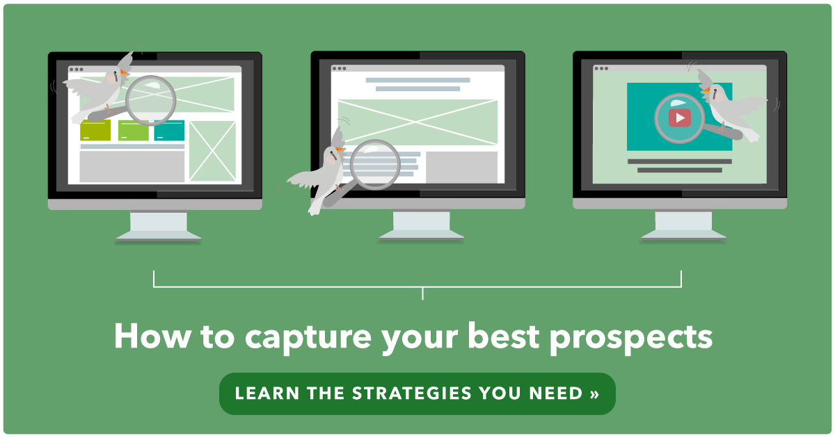
Mission-driven searchers are targets of vastly greater value than browsers
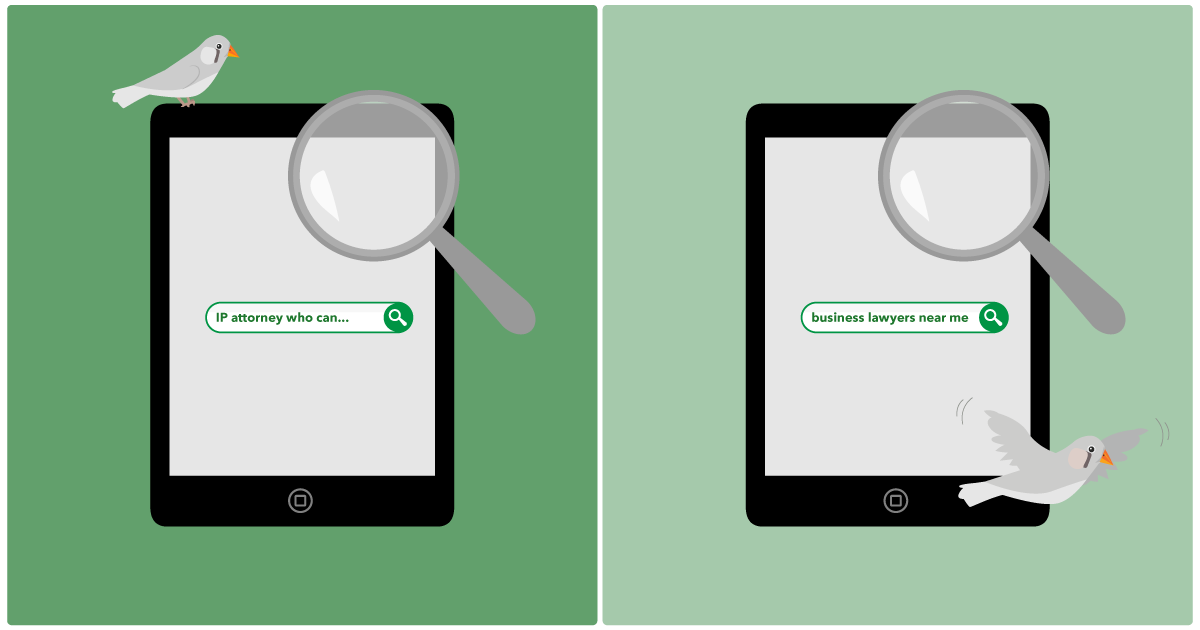
… especially when they hunt shrewdly, searching for what you do best. Landing pages to the rescue! You’re after those most valuable searchers: we call them the long tails. They aren’t just searching for broad topics that vaguely address their solutions (‘business lawyers near me’) – they’re using a laser-like search for an ‘IP attorney who can help license my new invention.’
Your home page might not work for someone searching, say, for part of what you offer. Yes, you’re a restaurant, but do you offer anything vegan? Yes, you’re a CPA, but do you do business formation? The long tail searcher might exit your home page and return to the search engine results page, impatient they didn’t find that vegan entree or C-corp-vs-S-Corp help they were looking for. Don’t try to make them sort through things they didn’t care about.
For long tail searchers, you need to offer valuable information that quickly spotlights what they are seeking. If you make them look, find, and click and click again to find what they want, you lose.
To engage the mission-driven searchers? Begin with research
Engage the searchers who are zeroing in on:
• not a law firm, but an IP attorney,
• not a college, but a pre-dental program,
• not a candidate, but a future senator who hates what I hate,
• not a supermarket, but an amazing cheese department
You need to know how many are searching, and for what. Take your amazing cheese department: we could research to see the most searched after cheeses in each county you serve. Maybe each store needs a separate landing page highlighting the most popular cheeses searched for in that area. That way, when they land on your page, they’re presented with some popular cheeses from their area, as well as some other really amazing ones they might like.
Remember, our long tail searchers hunt smarter. We need to identify the phrases they are using when searching to make a landing page to find and read. For our cheeses, that means doing some research into popular searches for cheese. Then, on the landing page for your amazing cheese department, you can highlight what you found in your research, as well as your other amazing cheeses. The long tail searcher will find what they are looking for — their favorite cheese — and others to look at and try.
Knowing what people are interested in — and the exact words and phrases they use to search for them — allows you to curate content that speaks and engages them. They’ll be happy: the first step towards them being brand ambassadors for you.
But wait! There’s another type of landing page you need
We always target mission-driven searchers first because, aside from investing in developing the landing page, the traffic is free. The long tail searchers who find you from search cost you no money. They find you.
But when you’re doing the hunting to find prospects or repeat business, it’s just as important to have a “you’ve arrived!” landing page.
When you participate in digital marketing activities (display advertising, social advertising, paid search, sponsored content, etc.), each campaign needs its own landing page. If someone clicks on an ad for your pre-dental program, they should land on a page that’s 100% loud and clear about your pre-dental program. Which your homepage is clearly not.
Much like with mission-driven searchers, if your warm prospect clicks on an ad, expecting information about estate planning for affluent seniors, they will be delighted when they arrive and see a picture and headline that scream that precise message. If, however, they arrive on your catchall homepage, will they spend time searching for the right information? That is not a gamble you should take.
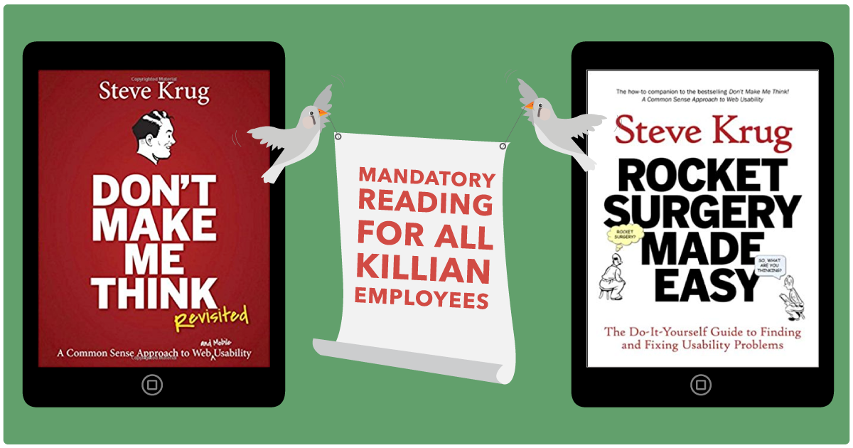
One of our favorite books on website design is Steve Krug’s Don’t Make Me Think. In it, he explains how the purpose of website design is to make the visitor think as little as possible. Every time they have to ask, “where do I find information about…?” or “do I click on this icon for what I want?” is another millisecond spent solving a puzzle. Steve’s point (and we agree) is that even if they convert and become your customer but had to think too much about the process… it wasn’t a pleasant experience. The easier (less thinking!) they do, the more rewarded they — and you! — will be.
That is (in tech speak) good UI = good UX. A thoughtful User Interface creates a good User eXperience.
It’s easy to find real-world examples to prove his theory, too. Just look at Uber or Lyft. Call a car to your exact location by filling out very few fields on your phone. No need to stand on the curb in the rain and pray for a taxi to pass and stop. Order from inside where you are. Simple. No thinking required except to push the button requesting a car. Taxis, who?
We like to use Steve’s theory especially when it comes to landing pages. When someone lands on your page, it should match their search inquiry or idea from the digital ad they clicked. It shouldn’t frustrate the visitor to stop and put effort into finding the information they are interested in. If the page they land on (headline, dominant visual, story) matches their expectations, the “you’ve arrived!” UX is off to a great start!
The last — and often forgotten — type of landing page
B2Bs, pay close attention here. There is a mistake many small-to-medium businesses make when it comes to website messaging. It involves how you talk to your audience segments.
All business have audiences they can segment — and these segments need to be able to find information specifically directed to them. Take our future senator (the one I hope hates what I hate.) If I’m a member of a teacher’s union, wouldn’t she, our future senator, want me to land on a page talking about her position on specific issues relating to me? Or if I’m a farmer? Having a page specifically designed to speak to my issues would be best for me to land on, right?
We like to use politician examples here because they are (usually) adept at crafting messages tailored to audience segments. At a factory, they’ll say one thing to workers about union rights. In front of a group of business leaders, their tone might shift. It’s the art of crafting messages to maximize votes.
Businesses — especially B2B — need to identify segments (men? women? young? old? Spanish-speaking? lapsed customers? whatev) to understand what motivates them – and how to talk to them. Then, create landing pages for any audience of meaningful size with personalized messaging. Segment your data, too. For our future senator, his landing pages for the teacher’s union and farmers could have forms visible to subscribe to a newsletter — one segmented by each audience. If a big issue broke in the news about teacher contracts, our senator could send an email just to teachers. Powerful no-waste-circulation stuff.
Does your landing page have everything it needs to close the deal?
You do all this work to create a landing page. What’s the payoff? What do you get out of it?
For our IP attorney, it might be to download a white paper on how to license new inventions, or register trademarks or protect against IP pirates from overseas
Our college might offer those interested in their pre-dental program a tour of their labs
Our future senator might get email addresses or donations or GOTV volunteers
Our supermarket customers might print out a coupon for brie
To convince visitors to do any of these things, the landing page requires urgent elements effective enough to inspire action: focused headline, convincing copy, engaging visuals, and a strong call-to-action (CTA).
Landing page headlines have one goal
Let the visitor know they’ve arrived! If your headline fails this goal, they’re going back to the search engine results page, the SERP. (“Serp city, here we come?”)
Subheads have another goal: to help break up your text. Too many “texty” paragraphs in a row and people won’t read. They won’t even start reading. Paragraphs longer than seven lines turn off most readers. Show readers three of those in a row and they’re gone forever,
Headlines and subheads break up long sections and give permission to skim. Our mission-driven searchers want to find what they are looking for fast. They skim all content, looking for headlines to tell them where to pay attention. If you have added enough subheads throughout your landing page, your mission-driven searchers will be able to spot what they want with no effort wasted.
With your headlines completed, your copy needs to convince the user to complete your goal. For example, why should someone sign up for our college tour? A quote from a current student who went on the tour could be useful to add, or a fun video from the tour guides inviting the visitor to see those dental labs. For our IP attorney, copy should include information about why anyone should care about licensing new inventions. To make him credible, he could include a summary of what people will learn from reading the white paper. He can let visitors know the value they’ll get from protecting against theft.
Words aren’t the only way to break up text
Visuals create “eye relief” too, which can advance your story and engage the reader. Developing visuals or using photos that complement your copy encourages people to read entire landing pages more. Going back to Steve Krug’s book, he talks a lot about how a page of just text looks much more intimidating to a visitor. They don’t want to read what reminds them of homework. Add headlines and visuals to the text, however, and people view it much differently. They think it will take less effort to read. BTW, they’re correct.
Finally, your landing page needs strong call-to-actions to convert the visitor into downloading your white paper or signing up for a tour or printing a coupon. The language needs to be clear, concise, and engaging to make the visitor take action.
Does your site have effective, strategic landing pages?
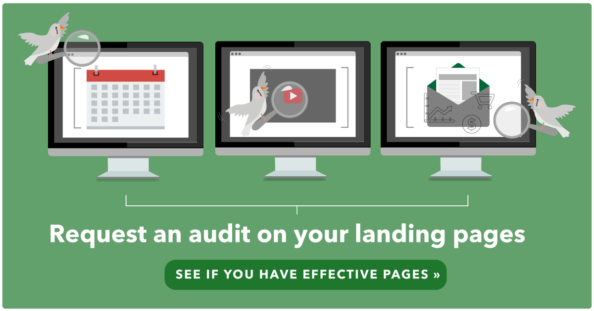
We can help you drive high-value targets to be captured, using proven tactics: better SEO and/or laser-focused online advertising.
Want to talk about specifics, to be more findable, close more sales and accelerate your growth? Find a time to chat on our calendar.
We are recognized as a top Illinois Web Design Agency on DesignRush
Evolve