Welcome to the Post-Literate Era: The Short Attention Spaniels
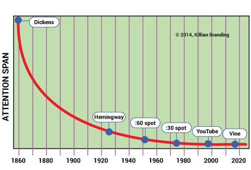
Brand holders need to be aware of this, including practical implications, such as starting a White Paper with a paragraph that’s one short simple declarative sentence. Welcome to the Post-Literate Era – a period that began decades ago, but which has gained momentum in the 21st century. The evidence is everywhere: we can even draw the graph of sustained attention, from a 19th Century reader willing to read David Copperfield over several weeks, to long-copy magazine ads of our grandparents’ generation, to web pages that are granted 4.5 seconds to show themselves relevant, or to Twitter’s 140-character limit.
Mathematically, the path along the x-axis is an asymptote, approaching (but never reaching) zero.

The short attention spaniels.
Should you shed tears for a lost generation? Picket your school system? Turn back the clock? Lighten up, Francis. Accept that it’s real, recognize that your communications may have to change, and that your competitors may not be adapting to this new reality as quickly as you. That, my friend, is not sociological hand-wringing: it’s one step toward an effective brand strategy.
You need to examine, or re-examine, every bit of text you use to communicate with your audiences: printed matter, including brochures, catalogs, ads, newsletters, letters, annual reports – plus electronic publications: web site, email blasts, etc.
Let’s audit all these documents with a couple of things in mind: what’s the apparent difficulty of reading, and what is the ratio of text to page size? The two questions are related. If a page appears to be a solid block of words, with long paragraphs, no pictures, no white space, and no subheads, a surprisingly large percentage of people will jump ship immediately. It simply looks too hard to read, regardless of content.
Of course, if your strategy is to prevent people from reading your contract, prospectus, drug interaction warnings, or footnotes to the auditor’s report, pile on those obstacles, tiny type, and paragraphs that start with “whereas.” If you want readers to glaze over, design for tedium.
Many business letters are formatted to a wide (6 inches or more) line length and a small bottom margin. Wall to wall words. Is the writer trying to get his money’s worth by filling up the page? Paper is cheap, friends; losing readers is expensive. Leave some generous margins top and bottom, left and (especially) right. Legibility experts recommend a line length between 2 and 3 alphabets (52 to 76 characters including spaces).
If a 60-character line width forces you to go to a second page, so be it. The odds are improved that the reader will actually stay with you.
Neil Sedaka was wrong. Breaking up ain’t hard to do.
Subheads (like the song-cue one above) offer eye relief. Three to ten simple words. You get the same sort of visual help from photos, illustrations, and callouts. Anything to prevent the dreaded block-of-gray.
Do the math.
A recent study concluded that the average American spends two hours every day watching television. Reading, on the other hand, occupies seven minutes. After age 13 or so, roughly two-thirds of Americans do not read for pleasure. (For the statistically-minded out there, that’s zero minutes.) The few who do read for pleasure, of course, have much higher household incomes (duh!) and might just be the market segment you’d address to, say, peddle BMW convertibles, or convertible debentures. But (and as Pee Wee Herman used to say, everybody has a big But) if you’re selling frozen french fries, fashionable frocks, or fire extinguishers, you’d better not expect your prospects to read long copy – long, in this instance, meaning a paragraph as long as this one.
Keep asking: Is this printed piece really needed?
Of course you can make blocks of words seem less intimidating, add lots of eye candy to the printed page (the USA Today-ification of text) but let’s also consider the possibility of chucking that printed page overboard. To a generation (or two) raised on TV and Grand Theft Auto, print itself may have become an inefficient medium, if not nearly obsolete. We’re not making a value judgment, just facing a reality that can offer you a path to audiences that your competitors may not be taking. Nor are we talking only about the young: virtually everybody under 65 grew up gazing passively at a glowing TV altar. (It’s not a demanding religion, but the services are hypnotic…)
Understand that you have the option of replacing text with pictures, of showing the story rather than narrating the story, of ditching the brochure in favor of YouTube. One web-page video may be far more effective than thousands of words. Re-think: are you automatically making readers read text because that’s what you’ve always done?
Your attention, please: We can help.
Even though you and we come from the still-literate pointy-end of the bell curve (since you’ve read this far, a fair assumption), we use and recommend branding tactics that leverage this post-literate reality, to gain a competitive advantage. Tell stories visually, put pictures into motion, make stories interactive. Sound strategic to you? Let us audit together how you convey your brand, to make sure your story is actually arriving the way you intend. Call us at 312.836.0050.